PASTEL
DEFENDER HELIOTROPE
How
The Comic Is Made, Page 4

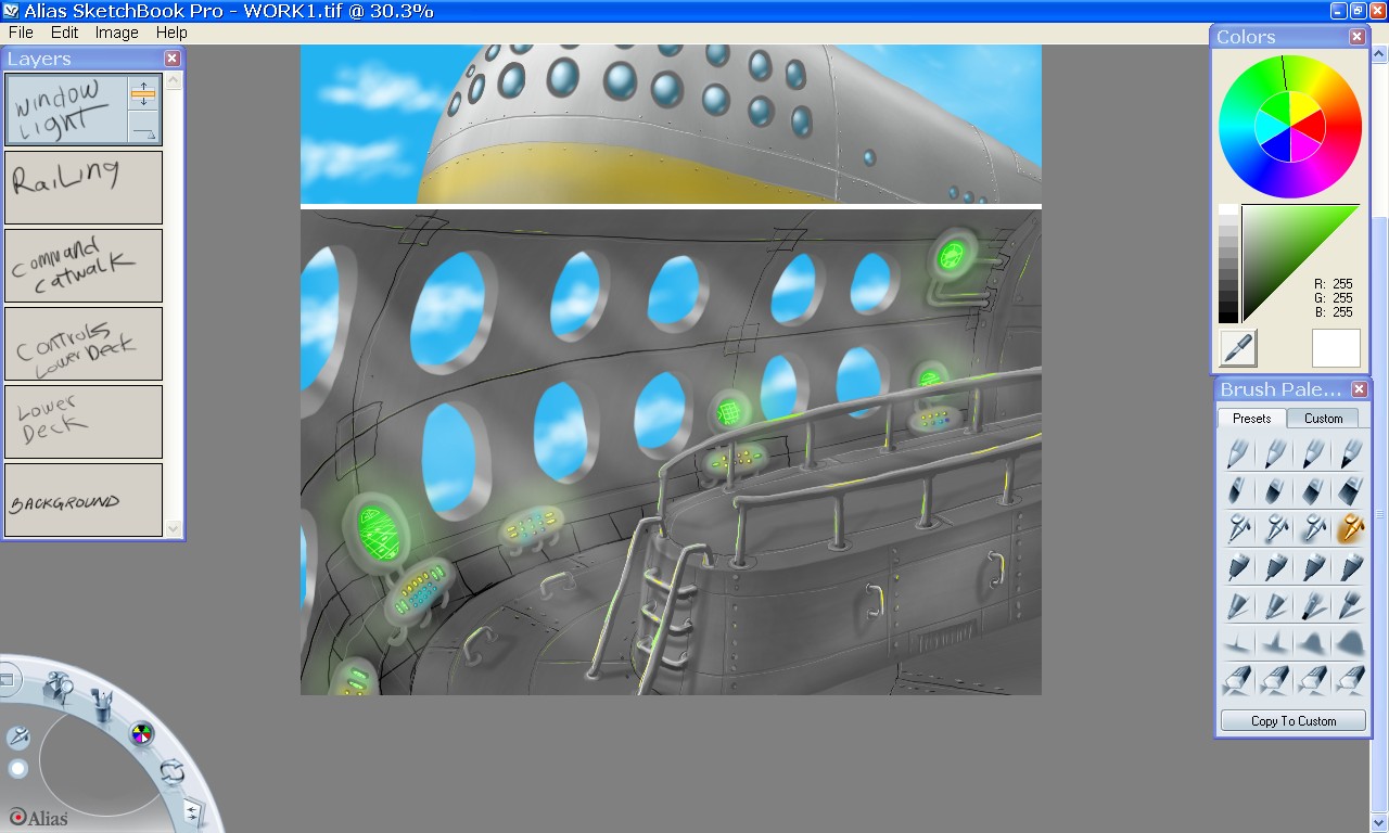
In this image we can see an actual-size version of the work in progress.

My standard screen environment is 1280 X 768, which is what this screen capture represents. Alias Sketchpad Pro is a wonderful tool, I heartily recommend it. Using my Intuos 2 digital pad, I can draw normally, just as if on paper, or canvas, only with the ability to undo. I have to admit that this capacity is so useful that I sometimes find myself unconsciously trying to 'undo' mistakes when drawing with ink on paper!
In the capture above, you can see the use of layers in progress, each layer named according to what is on it. As mentioned yesterday, layers are incredibly useful - from backpainting to erasing through, acting as airbrush friskets and more. One obvious use will be seen soon here, when I start adding characters to this scene. Layers are like painting on cels in animation. One thing I have tried to do, above, besides a nice metal texture, is to have rails and other chrome surfaces reflect the light from the controls and displays. I also am being more careful to add atmospheric light scattering, such as from the windows - I think it adds a lot to the scene.
What I am going for in this is a kind of 1940's style, as one would find in old Amazing Stories cover art of that time; huge metal superscience with lots of rails and glowing controls and huge round port holes.
As you can see the interface on the Alias Sketchpad Pro is lovely and simple. You might think this is a disadvantage, but it is actually a great advantage for me. While Sketchpad lacks all of the fancy and complicated labor-saving geegaws of other art tools, it has what is essential to paint freely and easily, and that is what I want to do. I feel baffled by the steep learning curve, and unintuitive interfaces of other programs. I just want to paint naturally. Flood fills and circle tools and geometry tools and shaders are all well and good - and I loved them in Dpaint, but they are no fun if they are a pain to use, or have off-center registration points, or have to have numbers entered into boxes because the damn programmers couldn't think of a way to make the use of them entirely fluid and transparent and intuitive. My port-holes may not be perfectly circular, but they do have a nice 'painterly' sloppyness about them, indeed, I find having to do everything by hand makes for a very definate visual look to the work. More organic, more emotional, in a way.
Next time, we put people into the scene.

By
Jennifer Diane Reitz
![]()
A
Part Of Jenniverse.com
All
Website Contents, including all characters,
images,
artwork, text, and any other contents are
Copyright
© 2004 by Jennifer Diane Reitz
All
Rights Reserved Worldwide

Anti-Spam
Address Image
To
contact Jennifer you may use either of the above addresses.
You
may have to type them in yourself, if your browser does
not
support Javascript. Otherwise, click on the button!
LINK
FREELY
You
may link to this site freely!
You
may FREELY use any JENNYVERSE title image as a link button!